
Luis
Tavares Pereira
(An)notations
Stan Allen
Logistical Activities Zone
Thomas Leeser
Architectures of Banality
(An)notations
Stan Allen
Logistical Activities Zone
Thomas Leeser
Architectures of Banality
(An)notations
1. Serene
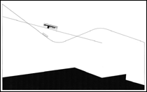
The site plan1, of impeccable elegance, depicts - or presents - a considerably sloped plot crossed by a diagonal trail. From the complexity and richness of reality, a decision was taken to represent pathways, contour curves and property lines. Three elements define the context where the project is set. Standing out.
Those elements2 are evenly represented, with the exact same criteria. A delicate and regular etching over which the project appears at the center of the image. Clear-cut. This identification process can only happen if the observer is familiar with the representational system and its subtleties. If the observer doesn´t recognize the tracing as a contour level, as a road, as with what is supposed to represent, the drawing loses its implicit architectural meaning.
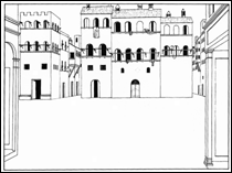
Another site plan, another project3, two lines only support the relationship between object and context. They´re even simpler, more austere and enigmatic. Nevertheless they accurately accomplish the task of providing significance to the project - establishing it in a planimetrical framework - and to the drawing - balancing and composing it, grouping distinct elements so they appear as a whole.
Getting back to the original drawing the perfect equilibrium of the composition should be stressed: the project and weightier elements at the center, the homogeneous tracing spread all over the sheet with evenly distributed irregularities, sketching balanced axis of organization.
The volumetric composition of the house4 is given through the three-dimensional illusion created by the projection of the volumes shadows, stark black, on the horizontal planes.
Following conventions, if the drawing is oriented North, the sunlight incidence angle locates its position on a late Summer afternoon. Being so low, the shadow should extend far beyond what is represented.
The shadow depiction does not translate its own reality. It is a symbol, adjusted to its communication necessities. A narrative device used to reveal the house massing. We can imagine, at the moment of representation, how it became evident the need to overcome reality, since the southward sunlight incidence would not produce shadows on the roof, thus diminishing the visual impact and perception of the volumetric variations.
The expressive coherence converges to communicate an emphatically volumetric architecture with unmistakable predominance of edges and plans. Volumes clearly mark the limits between interior and exterior. Their wise and harmonious interplay is animated by the contrast of light and shadow, the essence of architecture as Le Corbusier put it. How can we explain then, why the extended canopy over the room windows - a protector against harsh sunrays - is not set free of that surface and, instead, prolongs the lateral and roofing plans thus subverting the clear interior/exterior distinction? That element, hinting at an autonomy not given to it, fractures the perception of the project as volume its representation foretold.
In the Alenquer project, the house is presented under two distinct conditions: related to the context and, afterwards only5, as an autonomous object. As an object the house is built by the elaborate definition and compliance of rules - self-justified by clarity, but arbitrary in origin6 - ordering the formal definition of volumes and their associative logic in a generative process apparently autonomous of the context.
A set of simple, rectangular, container-like volumes of constant section is disposed in orthogonal manner; they juxtapose and balance themselves as if they were independent masses7. The section of the volumes is constant; the length varies. The expressiveness sections acquire in representation is also constant: walls, roof and floors are equivalent. The same stroke, the same continuous line. We can rotate or invert the drawing; it still makes sense. The openings on the containers do not work as windows but as plans, facets defined by the volumes edges. Openings are absences of a facet, always on its shorter side. Other rules forbid contiguous openings, either vertically or horizontally, and each container must point to opposite directions.
But the penetration of volumes housing the program takes on an associative logic not unlike the intertwining of DNA molecules8. The house as genetic structure. The concern put into the representation of the project, its specific context, indicates on the other hand a merging of object autonomy and contextual relationships in the project. The building is represented in its relation with urban morphology and topography. Liberated, because of its distinct expression in section, the existing represented in gray, the project in black. The study in plan and section of the surroundings and ruins is crucial to its placement9.
In plan it barely fits, tangent, providing additional tension. The longitudinal axis is aligned parallel to the lengthiest wall, distant enough to benefit from the light entrance, to breathe. While on the opposite side; a tangent volume to the wall purposely "scratches" the strategy. A dialogue between all the facets arises, constantly testing the limits of the site. A strained equilibrium is set by proximity and contending volumetric interplay. Tension is then the strategy to occupy a compact site with an objectual architecture. In profile, the tracing indicating the sloped street projection underlines the stable condition of the terrain where the house lands. The sensitive response of liquid bodies to the horizontal condition supplies an explicit sense of tranquility to all liquid surfaces resting. The presence of water inside the enclosed site10 is connected to this strategy. The tranquility welcoming the new object comes from the horizontal condition of the site, in opposition to the dynamic slope of the surroundings. Architecture is either contextual or it isn´t.
Permeable11, opens itself to the alert or curious passer-by. Impossibly slanted staircases, ruthlessly standardized façades. Indifferent to change of use or lighting conditions, unconcerned with the proximity or variation of masses. Loyal and obedient executors of a volumetric definition, heading to a calculated rendez-vous.
Two blocks enclose the villa Ventura Terra planned at the beginning of the century. In the meantime, the villa witnessed its splendid park interrupted by urban expansion. Compressed inside a block with a claustrophobic mass, depriving it from air and light, condemning it to a sad fate of having stood up. The L-shaped disposition of the new blocks cunningly occupy the available periphery: this is a ransom operation12. The project establishes a new context where the interior of the urban block is no longer a remaining space; it becomes the main atrium. These new volumes are asked to solve the relationship with the surroundings, provide a new spatial condition to the main access, and transform exterior into interior. Apparently we are faced with two rectangular boxes allowing only continuous surfaces in their planes. To the North, slim window stripes are set at eye level. South and West have glass faades with a laminated plan of brise-soleils . The desire of unity is understandable so as to create a backdrop, a serene, refined framing given by the elegance, density and weight of the laminated stripes and its braces. The perceptual relevance held by these elements inside the urban block is also understandable. Not only do they break down the sunlight, by stressing horizontal lines, they also domesticate the scale of the surrounding context. We can also perceive the exterior scale it has to confront and tame. The abrupt interruption of the glass faade gives room to a blind concrete wall, solving the proportion dilemma set by the organization of the program.
And although the concrete wall is a surprising choice, its is clear the laminated stripes are the real faade to which plans serve as backdrops.
On the insde the volumetric interplay is not limited to an absolute and arid regularity, blending articulately with other volumes and proportions. They welcome the presence of a slender and solid elevator tower in the courtyard and a similar volume in section aligned with the soft sloped access to the courtyard but wisely tilted with the previous one. Singled-out volumes, small abstract sculptures, filters of excessive permeability, protective but not reclusive13.
2. Agitated
It dismisses14 the existing building, interpreted as a matrix with a distinct representation, deprived of materiality15. Over the matrix an idealized system of singular architectural elements is placed, replacing a conventional perception of walls, openings and furniture: ellipsis, hollow spaces, "thickened lines"16, the "field". The wall disappears, giving room to singular vertical structures, elliptical or thickened lines unfolding successive pleats; the roof is severed by a grid of parallel profiles holding fiberglass objects, hidrodynamic shapes seemingly floating over the "field".
It is perceived as detached from any context17 other than its own. Formal autonomy of its elements is stressed, imposing a self-referential system that generates an independent logic. Like a ship in an imponderable sidereal space, standing out from the absolute darkness of the universe and receiving light from some solar system.
Resorting to multiple representational techniques -plans, sections, linear projections, slides, photographs -it gradually defines itself resisting immediate understanding.
Renderings - replacing models as a project presentation process - emphasize a composition strategy more than a spatial one. Enlivened by light and shadow interplay - aiming to represent/inform its architectural elements as three-dimensional - renderings convey how abstract the process is. They are less a real-life vision of the project and more of a selective isolation of described structures and sub-systems facing a transparent depiction of the existing building, which we will never really know. They reveal an order, the relation between different elements, but do not indicate their use. Restaurant, exhibition rooms and meeting rooms blend under a strategy of spatial unification. Explanation of their function - a simple description with the adequate furnishing, chairs, tables - is discharged.
Plan and section are also disturbed by subtle shifts to a conventional understanding of the project, suggesting accurate strategies of similarities between them.
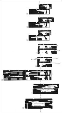
The first one is a stratified disposition, revealing a project not in conformity with stable cartesian planes. The generic section we call plan - slicing the building at a given height, approximately half the total height in order to intersect conventional openings, doors, windows - cannot fully describe the space. Due to the unpredictable and irregular changing condition of the walls, a regular section floor by floor is not enough. It is necessary to shorten the sample intervals, supplying additional accuracy to its interpretation whilst simultaneously complicating the task of the reader. Forcing a distance towards a classic notion of floo, getting closer to the concept of strata.
Another important disturbance regards the nature of information a plan holds we usually call layer18. This device can assemble the same type of information on a virtual strata devoid of thickness - unlike the former - efficiently including or deleting information according to desired communication and reading intents. The project is structured after a main framework - not necessarily aligned with the existing supporting structure - on which the generated layers are inscribed. Information is intersected in a physical and objective manner.
The conceptual shift this strategy produces on the project organization becomes clear, more systematic, settled, ordered, efficient, complex. A mental tool to select and organize complex information.
Reading a Morphosis project seldom is a simple task. It tests our interpretation abilities. It requires the unveiling of communication techniques.
The drawings, "intricately detailed and technically precise (...) For, while these representations seem to frustrate our achieving direct access to these buildings, instead they seem to entice both our ratiocinative and haptic senses"19. They are, aside from the sheer virtuosity and pleasure their conception and reading produce, an effort to overcome and adjust the projectÕs communication conditions, to which conventional strategies appear insufficient/inadequate.
A slice of land is open to construction20. Cultures converging, border and limits condition, "where the city meets the neatly plowed fields of the farmland". Fragmented, we perceive how the project is not communicated in its entirety, always framed, subdued to delicately balanced compositions, breathtakingly seductive. Patches corresponding to program organization diagrams simultaneously create shapes and volumetric expression, establish relations. There is a triangle of land appearing to be perfectly defined, focusing our attention. But we know the logic expands, we are standing beside an urban model.
Construction of several environments. Perfectly isolated, identified. By singling out fragments, another project is built, it acquires independance - the sequence of clearly defined and belenced perspectives substantiates this. Multiple generative sources organize the program according to pragmatic criteria, locating the most important elements of the program in a strip of potentially urban status: city typology. Orthogonal axis, rural landscape typology, urban landscape typology, seismic shifts of tectonic plates, masses arising from horizontal landscapes...
Alternation: it either goes up or down, forward or backward. Folds and rotations are regulated by composition and equilibrium of forces.
Gone are the sketches and models, but we suspect they aren´t really gone. Let us envision the moment when the project gained form. When the memory is also involved in that labour of contact, creation, tranquility, multiplicity and simplicity. A relentless architectural vision, attacking its constructive system, exposing it, using it as a trace, a notation. .
3. EQUATIONS AND NOTATIONS
We are acquainted with several variations on project representation, be it ink or pencil, plan, section or elevation. Clearly drawn lines on the contrasting paper surface, one way or the other. Drawings which do not rely on shading, color, patterns or chiaroscuro, displaying a particular accuracy and economy, as if mind and eye of the author were absolutely focused on the slightest touching point of pen and surface. Over a sheet plan, the line21, representation of its own abstraction (defined mentally as pure concept, no thickness or dimension), is physically inscribed in a material plan. It is also a material object with particular features, overlooked and neglected by reading habits.
Like the word, "the line dwells on the wide possibilities inside a tripartite division between signifier, signified and sign", dependent of its associative context. From this evidence, the line is able to take on a series of roles (change, repetition, volume, section, connotation...). Complying to a set of precise univocal instructions and rules it is able to unambiguously form clearly recognizable figures (plans, sections, elevations, axonometries, details...) interpreted as the objective analysis and realist depiction of the project. The line is deployed, for these purposes, as a neutral utensil22.
But all these figures (plan, section...) can actually transmit ideas and sensitivities beyond their apparent integrity as recognizable figures. "Particular arrangements of line (drawings) and line constructions (buildings) are read to varying degrees of intellectual investment (by a variety of readers) as being culturally symbolic in some way or other, in that line is read as acting as a signifier for 'something' outside of itself, and not simply for itself. These readings are seen as dependent on the perceived (past and present) practices of line, as seen to exist (and yet contested by various subject groups) within the permissible archives of the already drawn, the already built."23. Thus the line is inevitably an ideological device, subjected to the author´s expressive options or the reader´s interpretative abilities, influenced by its relationship with history of architecture and favored representational systems. Objectively the line tells us nothing on what links architecture to social space, resting confined to volumetric relations between physical objects. The transverse scope of architecture, its links with related disciplines, is subdued to the necessity of communication supplements based on the written word (caption, briefing) capable of transmitting it. The line has limited articulations. It can hardly communicate beyond the outline, the seam. It can register a change of material, but cannot characterize it. This limitation paradoxically endows the line - by author as well as reader - with an overlaying of meanings that can only be understood as genuine, implicit to the representation of the discipline. The line is a synthesis of meanings and absent intentions.
The project cannot be immediately understood. It has to be described, translated into notations and concepts before it can be explained. This conceptualization of the object is what allows us to relate with the problem, circumstances and the author´s purpose, since these are also the concepts. Sooner or later these reference terms have to be inscribed inside the work.
Cartography can enlighten architecture in a practical way, providing specific physical information, or in a metaphorical way, supplying different ways of thinking about relationships. The map is simultaneously a real object holding information and one of the most common figures of knowledge organization.
The need to chart the features of a place in terms of social codes, to register the negotiation between project economy and site conditions, led to new representational conventions and processes, liberated from descriptive geometry, introducing notations specifically related to the aforementioned negotiation24.
Notations25 participate on the communication of a project in several ways. First they can be a supplement of information, completing what the line was not able to depict. Then they can respond to adjustment problems between communication and content, interpretation obstacles, in order to clarify or obscure them. But they can also be codification devices. Subdued to the concerns and preparations required in a confrontation, the presentation is arranged to seduce, to convey the project´s interaction specificity, to delete what seems unclear. Notations immediately participate in communication to surpass paradigms, as a critique to the instrumental neutrality of representational techniques and procedures. They can also be understood as an accumulative logic overcoming a synthesizing logic.
Aires Mateus settle upon the consolidation of the object, on simple solids. The idea of definition, of limit, acquires materiality, becomes an object, research and experimentation oriented. Each facet converges to the uniformity of the plane, to indifference. They aim to consolidate the object´s limits - the edge is a line. Simple as a black line against a paper backdrop. That line is also a synonym of simplicity26 of processes. An architecture of scarce resources with "the aesthetic motivation of line which is indicative of works associated with a minimalist strategy, which combine a highly reduced line palette with a clear visual ideology"27. Today, going back to the simple and elementary implies integration, discipline of the complex and real. Structural calculation became complicated, separated from architecture. Infrastructures are more elaborate, juxtaposed, dense, compromising. Technology is diverse, required, contradictory. Social and cultural implications informing and consuming the project are also complex. Aires Mateus acknowledge this as architects, facing construction in their practice and domesticating it. Maybe that is why the project is seen as a battlefield on which architecture is settled - well settled - to convey a sense of clarity leading to the required simplicity. The trick is also to elliminate unknown factors of the problem in order to be more easily resolute. Architecture as an equation.
Morphosis were particularly influent in directing a considerable part of the effort put into a project to the planning and rendering of its communication. They proceeded to chart other realities beyond the description of the conventional physical features: relief, property lines, enveloping shapes. You can read that intention on the projects, but their exploration of representational possibilities supplied clues to other readings. They investigated the merging of representations, the significance of other disciplines´ specifical graphic writings - military or media representation, motion notations, measurement markings.
The vast array of procedures used in the communication of the projects, also subvert the idea of converging universal standards positivist society is trying to implement. They call our attention to the adjustment of depiction and depicted. The fragmentation of the object commanding Morphosis architecture has its appropriate response on the fragmentation of communication. Always partial, always exploratory. The process is emphasized, successive developing moments are selected, frozen or carved, singled out of their own process, given plastic and conceptual value. Construction procedures of a building are equal to the construction procedures of a project or a drawing. Geometry devices acquire the status of products. Construction lines turn into context, a self-referential drawing.
The project itself, the built work, is a notation in itself, recordings of a construction act. Marks of a composition method, annotations of that experience. Registrations turned into construction, into architecture, a memory of construction.
The shattering of the box does not share the modernist sense of the plan, instead it reveals the elements conforming it, the structures constituting it. It is also a question of focusing, of singling out the identity of each composite28, the assemblage modes, or better yet, the assemblage geometry. Limits of the different layers do not match: some extend themselves, others contract. The structure also isn´t aligned by plummet, forcing complex vector decompositions.
Morphosis buildings are simple machines - pulleys, counterweights, wedges - characterized by the relationship between their effort and visual translation29. Architecture as a reading instrument and reflexive interpretation.
Notes
1 Urzal House, Aires Mateus & Ass.
2 Inevitably we are forced to question representational options -why the homogeneity? - and criteria - why the property lines and not the vegetation?
3 Luanda University, Aires Mateus & Ass.
4 A small U-shaped courtyard in one of the edges, the swimming pool as an extension of one of its "arms". Like a hand. A hand with fingers bent together while the index finger stretches and points out to the swimming pool, conceptual extension of the volume.
5 The sequence of these factors is not arbitrary. The object can be successfully moved to another location, preserving its features, but constitutes a response to the specific requirements of that place.
6 Product of the author´s idiosyncrasy, of his inherent subjectivity.
7 Slab thickness is fittingly duplicated on the contact surface of the volumes, ensuring its exterior reading corresponds exactly to two overlaying volumes.
8 Observation made by Eng. Faro Barros.
9 In this case it seems more appropriate to use the term placement instead of location.
10 Paradoxically however, the presence of water in a strip of the plot bounded by the preexisting walls balances the composition of both areas defined by the enclosure, while at the same time - since the tank is carved close to the walls - seems to weaken their stability. Aires Mateus handle and even emphasize this issue in a perfectly conscious manner. Thus the depth of the swimming pool is detached form the wall to consolidate structure. At the surface though, a few inches are enough to bring the water next to the wall, creating the illusion it is sunk.
11 Engineers Guild Headquarters, Lisboa, Aires Mateus & Ass.
12 One could propose a martial rhetoric, unveiling a surgical ransom operation, resorting to a strategic disposition of the site forces and challenging the conventional in a heroic way.
13 Visually everything appears to be calm. The weight of the solids, the clear-cut edges, the geometry drawn on the coating materials, the untarnished clarity of complete rectangles.
14 ASE Design Center, Taipei, Morphosis.
15 There isnÕt a clear distinction between full and hollow, supporting and dividing elements; in fact there isnÕt an explicit interior/exterior relationship. Where are the windows?
16 The "thickened lines" expression is intriguing. We can anticipate an origin located in the project practice, an accidental shift interpreted as a positive contribution. Is t a plotting error? An a posteriori formal analogy?
17 Or, on the contrary, a very strong context interpreted as a "non-context", "a vast undifferentiated development of gridded interior space", with an undeniable existing limit: the curved boundary of part of the building imposes the ellipsis as a contextual imposition.
18 "a series of independent layers, superimposed together to create a coherent, more inclusive whole. (...) This is a process that studies the inherent nature of architecture as a multilayered discipline combining the constituent elements of separate material into a single unified entity. The resultant overlapping of ideas and layering, juxtapositions and superimpositions, purposefully blurs the standard relationship between graphic conventions of building as plan, section, and elevation, and their meanings in the built realm." Elizabeth Martin, Layered relationships in Architecture as translation of music PA16, Princeton Architectural Press, New York, 1994, p55.
19 Val K. Warke, The labors of bliss in Morphosis: obra completa Catalogue of the exhibition at Ministero de Fomento, Madrid, Ed Centro Publicaciones, Ministero de Fomento, Madrid, 1999 p34.
20 Hypo Alpe-Adria Center in Klagenfurt, Austria, Morphosis.
21 This consideration was partly based on the reading of Gordon Shrigley´s Periphery Insignificance: a short discourse on the Physical and ideatonial economy of line within architectural representation, ed. Solitude, Stuttgart, 1998.
22 "Visual language needs to fabricate an unobstructed connection between thought (perceived as the author´s ideas transparently represented on the drawing) and action (as the one necessary to physically build a building)." Shrigley op. cit. p73.
23 Shrigley op. cit. p81.
24 The key to its understanding, its communication power comes exactly from its singularity, the unequivocal relationship with a practice not seen as just a discipline but as a specific context for each project.
25 No-ta-tion 1. A system of graphic symbols for specific use different from common writing; musical notation; 2. The process or method of taking notes or recording through a special system of signs and symbols 3. The act of annotating, marking or recording by writing 4. A note, indication or registration; annotation: side annotations L notation substantive of notatio in Webster´s Encyclopedic Unabridged Dictionary of English Language.
26 "The most natural thing in the world is the emigrant´s house, completely natural, a pure logical explanation for each thing; stone on the ground floor because there is the foundation, pitch in the joints or tiles so the water doesen´t come in, there is no double wall, there are no continuous surfaces because they damage easily, the plaster is rough so the cracks don´t show and the colors are very rich for the same reason, it is a sum of natural operations and the response is natural. This proves that the stupidest, most horrible thing is naturalness, and that the problem is the opposite: complicated is simple, simple is complicated." Eduardo Souto Moura quoted by Roberto Collovà, Bouro, una storia continua in Eduardo Souto de Moura: Temi di progetti, ed Skira, Milano, 1999, p29.
27 Shrigley op. cit. p102.
28 "More than a surface, each part has substance. Naturally the clues were cast since the house projects. A constant stimulating and fascinating aspect of their work is that we can never dismiss it as a diagram: it is constantly necessary to analyze the structure, the surface, the edges. It is a solid architecture: product of craft and organization". Peter Cook, Thinking urbanists in Morphosis: obra completa, Ed. Centro Publicaciones, Ministero de Fomento, Madrid, 1999, p30.
29 This notion of introducing a visibility, almost a code, to project practice is curiously close to Scarpa´s work - also a man of visual composition. The sensitiveness towards materials, colors, shades. Emphasizing the moment of contact, the fold, the pleat, the gap. Scarpa signals these transition moments with an additional element, an additional curve.